by John Jensen
Designing printed pieces for older donors requires special thought and consideration. Regardless of the subject matter, the basic design rules and techniques remain.
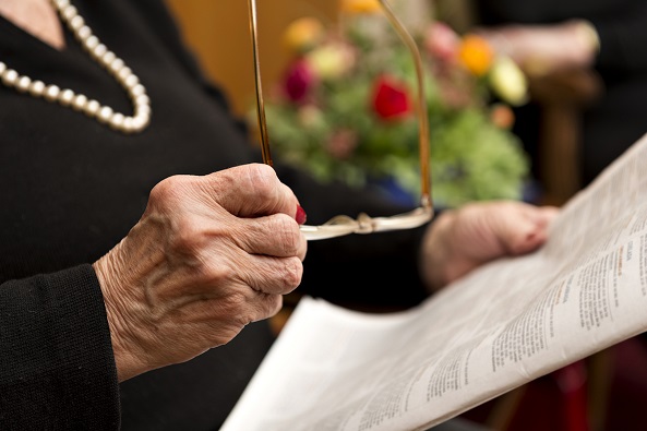
Design printed materials so they can be easily read by anyone, and then review them through the eyes of your primary prospect: a donor over age 70. Keep in mind that the average age of those who fund gift annuities is 79. Sharpe studies consistently show bequests are most likely to come from donors who sign their final and operative wills, on average, five years prior to death.
By following these 11 guidelines, you will make your material more senior friendly.
1. Use a large and comfortable typeface.
For letters and articles, it’s best to use 13-point type. Fourteen point may be even better. While this may mean you have to cut the length of your text, just remember an unread message has no impact.
2. Use italics rarely or not at all.
Italic and script typefaces are difficult for seniors and others to read, particularly when they are used for more than one or two words. When you want to emphasize a point, use bold, a different font or underline it if it is not too long.
3. Left justify your text.
Left justified text is easiest to read for seniors. Avoid blocking paragraphs with right and left justification, as this results in uneven word spacing, which is also much more difficult to read. Center justified text is also uncomfortable for seniors.
4. Indent every paragraph.
Flush left sentences seem formal, cold, distant and uninviting. Indented paragraphs will catch the eye and are more appealing. Studies show older people are used to and trust copy indented in this traditional way.
5. Keep sentences, paragraphs and line lengths short.
Seniors will tend to read only the first line or two of a paragraph that is longer than seven lines (lines, not sentences).
6. Use high contrast.
The contrast and crispness of the text and design against the paper are vital for readability. Never use light, low-contrast colors or print on a dark-colored paper. Black, dark blues and deep green letters are much easier to see than light ink colors. Yellows, browns, reds, pinks and oranges can be hard to read. Anything that is difficult to read is less likely to be read.
7. Take care when using background screens.
If a background screen is used, make it as light as possible (15% is good). A heavy screen or dark color will reduce contrast and readability. Never use a screened photo, text or image in the background behind your copy. Those types of screens reduce contrast, break up the text and make it difficult for seniors to follow easily.
8. Be cautious using reversed type.
“Reverse” refers to a block of color in the background with the actual text in white or another color. Seniors find reversed type very difficult to read as the letters tend to “fill in” with the adjacent color block. Reversed type should always be avoided when writing a paragraph or an article. When used in a headline, make sure it is short and keep the typeface large and the contrast strong.
9. Watch out for coated paper stock.
Coated paper surfaces (like high gloss) take ink well and look nicer initially, but they can create glare for older eyes. This reflected glare makes the text significantly more difficult for seniors to read. It is much easier for them to read material on uncoated or lightly coated matte or similar paper stock.
10. Remember reading levels.
Make your writing easy to read. Write to a level that is appropriate for your readers. In general, it is a good idea to write to a fifth-to-ninth-grade level. Keep in mind the great majority of seniors over age 75 lack a college degree. Even if your donors are highly educated, writing to a lower reading level simply makes your message easier to read or skim. Anything that is easier to read is more likely to be read. To put this in context, most blockbuster novels are written at a seventh-grade level.
Making copy easier to read does not mean “dumbing it down.” It means using simple, direct writing and often shorter sentences and paragraphs.
Most word processing programs have the Flesch-Kincaid readability index tool that can help you determine the education level of a document you have written. To find out how to activate it, Google “readability index” and the name of your software program. The tool normally runs with spell-check and instantly gives you a score for readability and the level of education required to comfortably read and understand the document. Once you understand the scoring system, making adjustments as you go becomes easy.
11. Design for the reader.
Give & Take is designed for a younger audience. Sharpe booklets and other marketing materials on topics that appeal to older donors, on the other hand, are designed for seniors and look very different. Compare for yourself.
One final tip
Eyesight declines noticeably by age 45, precisely the time many of us need bifocals. Keep in mind that by designing for seniors, your printed materials will also be easier and more inviting for all ages to read!
 Editor’s note: John Jensen presents this and other topics for fundraising professionals throughout the country. If you are interested in this more in-depth and illustrative presentation for your group, please contact our Speakers Bureau at info@SHARPEnet.com or 901.680.5300. For more information about our Speakers Bureau, visit SHARPEnet.com/speakers-bureau. ■
John Jensen, CFP®, is a Senior Vice President and Senior Consultant for SHARPE newkirk.
