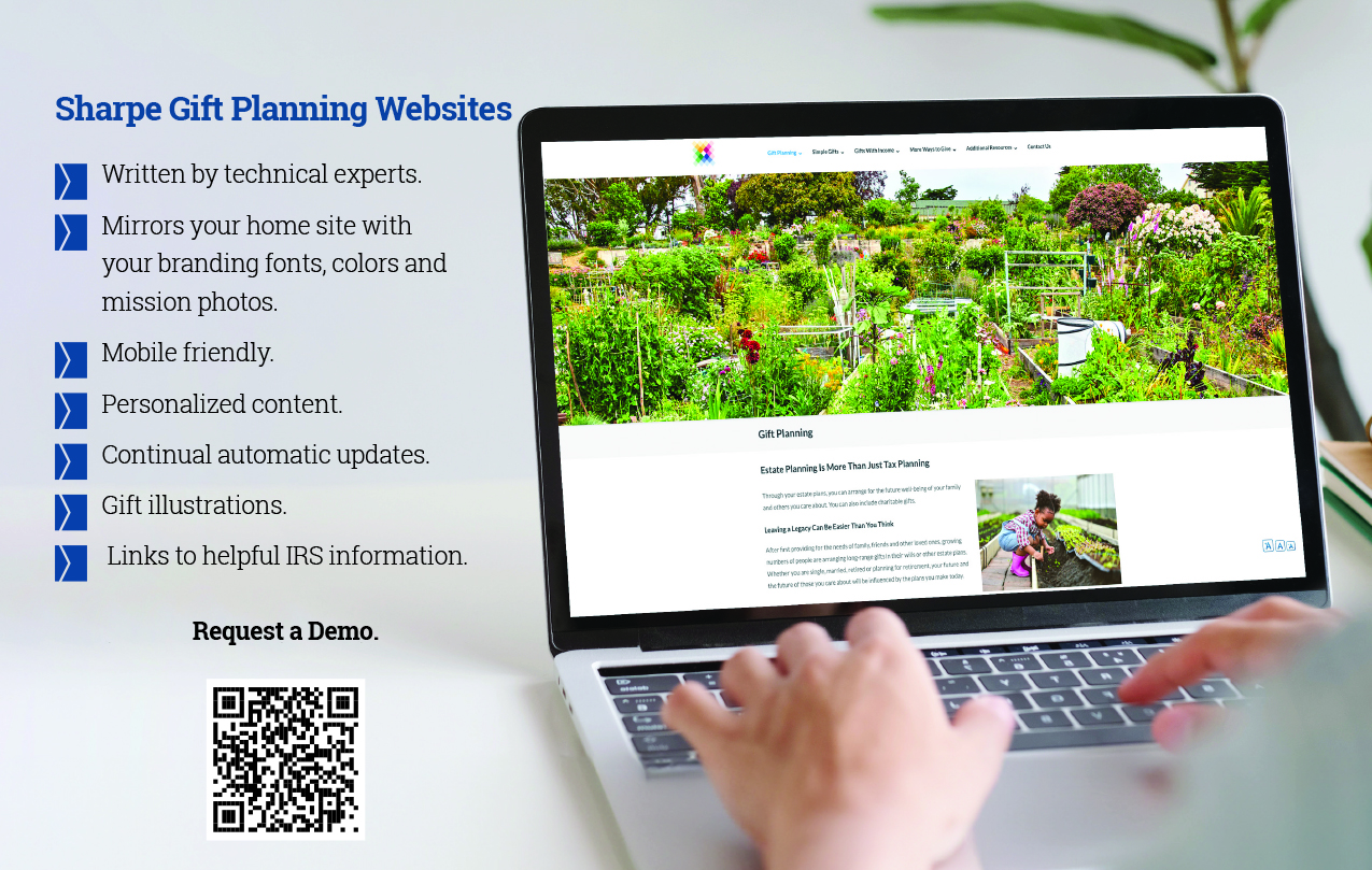
Your organization’s gift planning website should be simple, clear and easy for older individuals (i.e., your best gift planning prospects) to use. When designing your site, the physical challenges your 65+ audience could be facing, such as a decline in vision, arthritic joints, hearing loss, reduced short-term memory and poor eye-hand coordination, should be considered.
For instance:
- Make your gift planning site easily accessible from your main website. Don’t expect seniors to navigate multiple clicks.
- When incorporating your branding, use simple font styles and basic colors for better readability.
- Avoid multi-level menus and complicated navigation.
- Keep the technical content simple and easy to understand. Provide hyperlinks to more complex or detailed information that can be shared with advisors.
- Scrolling through a longer single page of text is better for seniors than clicking through layers of truncated text.
- Is your site mobile friendly? More and more seniors are using smartphones and iPads to access online information.
- Have staff photos with contact information, including phone numbers. Gift planning is all about relationships—show your donors who they are communicating with and how to confidentially get in touch.